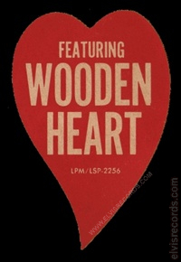
The Wooden Heart sticker that is associated with and may be applied to some of the covers of the early pressings of G.I. Blues is one of the most counterfeited stickers on the market. A goal of this article is to identify key differences between an original sticker and one questionable example. It should also be noted that there are likely many different variations between counterfeits. A purpose of this article is not to attack any individual or specific piece, however, to serve as a resource to quickly identify questionable, non-genuine, counterfeit, or bootlegged stickers as compared to an original. Of course, if the sticker passes all these tests, then a physical examination would be prudent. Sticker edges, has it been pealed, cut smoothly, or rigid. The texture, the color, the shape, and so on.
At a quick glance, the two stickers may appear quite similar if not identical in design, however, there are many differences between the two. The sticker on the right is a known good example of an original sticker as found on the original pressing. The second, questionable sticker was also found on an original pressing. Both stickers have been taken from their original sources images and oriented as close as possible to the same scale as one another. The second image was slightly taken at an angle, hence the somewhat skewing of the letters.
Before continuing to the fonts, a note about the curvature of the heart. Where the heart creates the crevice at the top, there should be a pronounced and sharp curvature as seen on the left. The image on the right has a large, rounded curvature which is a good indicator that the sticker is not genuine.
The color of the font is nearly purely white. Genuine examples should have some wear or glue bleed through the sticker giving it some off-white appearance with age.
A non-scientific approach in identifying characteristics between a genuine and questionable sticker by analyzing the font. This is a basic analysis, further detail could be identified, however, this detail should be more than adequate. Each line has been broken into pairs, where the top is the questionable font and the bottom is the genuine font.

Top: F and E, all three horizontal lines are identical length. The R is curved at the crevice and the center and top are heavier font than the sides. The I is narrow. The G has a rounded back.
Bottom: F and E, the middle line is smaller than the top and bottom. The R is straight at the crevice and the font is consistent throughout. The I is consistent with other letters. The G is is compact with a straight back.
Top: The W, where the two Vs meet extends past the bottom inverted V. Heavy font for the O. The E has all three horizontal lines at identical length. The N, the crevices extend past each other.
Bottom: The W, the three Vs meet. Consistent font for the O. The E has a smaller line in the middle than the top and bottom. The N, the crevices meet
Top: The E has all three horizontal lines at identical length. The R is curved at the crevice and the center and top are heavier font than the sides.
Bottom: The E has a smaller line in the middle than the top and bottom. The R is straight at the crevice and the font is consistent throughout.

Top: The M, where the two outer lines are straight lines from top to bottom. The angle of the / is more like 20-30 degrees. The number 6 is curved downward. The letters appear to be bold.
Bottom: The M, where the too outer lines are angled lines, where the bottom is further out than the top. The angle of the / is more of 45 degrees. The number 6 is straight and upwards. The letters appear to be regular.
This article was inspired by several emails that had been received regarding this subject matter and through a discussion that can be found on the FECC.


